Acquia Optimize Dashboard
Oct - Dec 2024
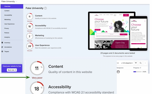
Acquia's optimize is a website optimization tool that needed a re-design to address customers pain points.
Project Objective
For this project, I worked as the design researcher in collaboration with the staff designer who was onboarding me onto the product and a product designer. We worked with a project manager, two customer success team members and the vice president of product.
The project objective was to
- Understand what triggers platform logins
- Identify the current pain points within the domain and dashboard
- Propose a redesign of the experience
Process
We used an agile method, designing while conducting research. Towards the end of the project, the deliverables changed, as the vice president of product wanted a more innovative approach to the res-design and to include a re-structure of the entire IA and what the product could be.

Personas
Initially, the project manager and vice president of product wanted us to design using assumptions from the customer success team. We asked questions if they had any qualitative or quantitative data available on what the customer pain points were and they didn't. We advocated to conduct interviews to gather current behaviors, challenges and needs and were given the approval to start with discovery research on the personas we were going to design for, the admin and content creator.

Research
To get inspiration for the initial designs to show with customers during the interviews, we conducted a competitor analysis while we worked on conducting qualitative research interviewing 5 customer.
Added to First Draft Dashboard Designs
● Clear left hand navigation
● Call to actions using colors and words
● Deeper analytics

With the first draft of designs ready to go, we created a research plan with questions about what triggers the user to enter the product? How do they use the domain and dashboard page? We recruited 5 customers to interview that were a mix of the Brittany and James personas to get a perspective of the differences in using the dashboards and triggers. We had them share their screens and walk us thorough the actions they take in a typical day. We then shared with them the first designs with some prompts to identify if the new analytics and navigation addressed any paint points.
Result
To get inspiration for the initial designs to show with customers during the interviews, we conducted a competitor analysis while we worked on conducting qualitative research interviewing 5 customer.
Recommendations:
- Lead users to what needs their attentionwith a list of priority issues.
- Reduce the number of clicks to provide direct navigation to the work.
- Provide Admins with analytics that help them measure, monitor, report and share progress towards compliance, project
and business goals.
- Add a bulk feature to work issues across pages
-Add features to identify progress of efforts


Pivot
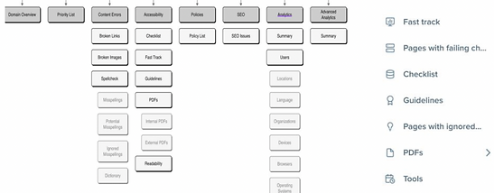
With the pivot to no just design a dashboard but create a more innovative approach using the product and now that we better understood our users needs, we mapped a new AI and developed some new wireframes to skip working on the product all together and have the user enter directly into the CMS to work on resolving issues.
The initial recommendations have been added to the roadmap for V1 and and the rest will be added this year with additional workshops with product and engineering to prioritize new features and ensure feasibility.


